Plotting functionality#
Here we will have a look at the different options for finetuning pairplots and marginal_plots.
Lets first draw some samples from the posterior used in a previous tutorial.
import torch
from toy_posterior_for_07_cc import ExamplePosterior

from sbi.analysis import pairplot

posterior = ExamplePosterior()
posterior_samples = posterior.sample((100,))
We will start with the default plot and gradually make it prettier
_ = pairplot(
    posterior_samples,
)
Customisation#
The pairplots are split into three regions, the diagonal (diag) and the upper and lower off-diagonal regions(upper and lower). We can pass separate arguments (e.g. hist, kde, scatter) for each region, as well as corresponding style keywords in a dictionary (by using e.g. upper_kwargs). For overall figure stylisation one can use fig_kwargs.
To get a closer look at the potential options, have a look at the following dataclasses.
FigOptionsdataclass for figure stylisation.ContourOffDiagOptions,HistOffDiagOptions,KdeOffDiagOptions,PlotOffDiagOptions,ScatterOffDiagOptionsdataclasses for styling the upper and lower off-diagonal regions.HistDiagOptions,KdeDiagOptions,ScatterDiagOptionsfor styling the diagonal region.
You can find the dataclasses in analysis/plotting_classes.py.
As illustrated below, we can directly use any matplotlib keywords (such as cmap for images) by passing them in the mpl_kwargs entry of upper_kwargs or diag_kwargs.
Migration Note#
Previously you would pass nested dictionaries to diag_kwargs, upper_kwargs, lower_kwargs, and fig_kwargs arguments. This is still supported for backward compatability, but we recommend using the dataclasses listed above for clarity and autocompletion.
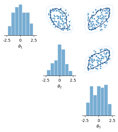
Let’s now make a scatter plot for the upper diagonal, a histogram for the diagonal, and pass the respective dataclasses for both.
from sbi.analysis.plotting_classes import HistDiagOptions, ScatterOffDiagOptions

_ = pairplot(
    posterior_samples,
    limits=[[-3, 3] * 3],
    figsize=(5, 5),
    diag="hist",
    upper="scatter",
    diag_kwargs=HistDiagOptions(
        mpl_kwargs={
            "color": 'tab:blue',
            "histtype": "bar",
            "bins": 10,
            "edgecolor": 'white',
            "linewidth": 1,
            "alpha": 0.6,
            "fill": True,
        }
    ),
    upper_kwargs=ScatterOffDiagOptions(mpl_kwargs={"color": 'tab:blue', "s": 20, "alpha": 0.8}),
    labels=[r"$\theta_1$", r"$\theta_2$", r"$\theta_3$"],
)
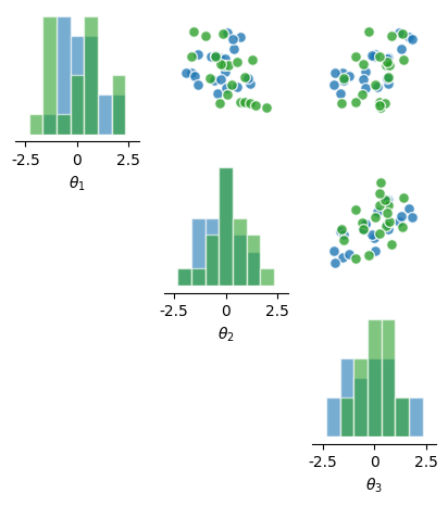
Compare two sets of samples#
By passing a list of samples, we can plot two sets of samples on top of each other.
# draw two different subsets of samples to plot
posterior_samples1 = posterior.sample((20,))
posterior_samples2 = posterior.sample((20,))

_ = pairplot(
    [posterior_samples1, posterior_samples2],
    limits=[[-3, 3] * 3],
    figsize=(5, 5),
    diag=["hist", "hist"],
    upper=["scatter", "scatter"],
    diag_kwargs=HistDiagOptions(
        mpl_kwargs={
            "bins": 10,
            "edgecolor": 'white',
            "linewidth": 1,
            "alpha": 0.6,
            "histtype": "bar",
            "fill": True,
        }
    ),
    upper_kwargs=ScatterOffDiagOptions(mpl_kwargs={"s": 50, "alpha": 0.8}),
    labels=[r"$\theta_1$", r"$\theta_2$", r"$\theta_3$"],
)
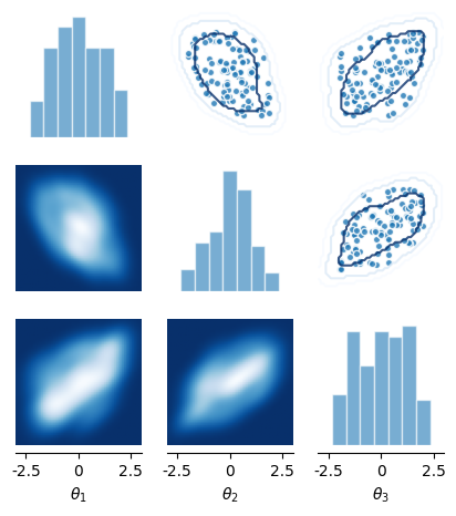
Multi-layered plots#
We can use the same functionality to make a multi-layered plot using the same set of samples, e.g. a kernel-density estimate on top of a scatter plot.
from sbi.analysis.plotting_classes import FigOptions

_ = pairplot(
    [posterior_samples, posterior_samples],
    limits=[[-3, 3] * 3],
    figsize=(5, 5),
    diag=["hist", None],
    upper=["scatter", "contour"],
    diag_kwargs=HistDiagOptions(
        mpl_kwargs= {
            "bins": 10,
            "color": 'tab:blue',
            "edgecolor": 'white',
            "linewidth": 1,
            "alpha": 0.6,
            "histtype": "bar",
            "fill": True,
        },
    ),
    upper_kwargs=[
        ScatterOffDiagOptions(
            mpl_kwargs={"color": 'tab:blue', "s": 20, "alpha": 0.8},
        ),
        ScatterOffDiagOptions(mpl_kwargs={"cmap": 'Blues_r', "alpha": 0.8, "colors": None}),
    ],
    labels=[r"$\theta_1$", r"$\theta_2$", r"$\theta_3$"],
    fig_kwargs=FigOptions(despine=dict(offset=0)),
)
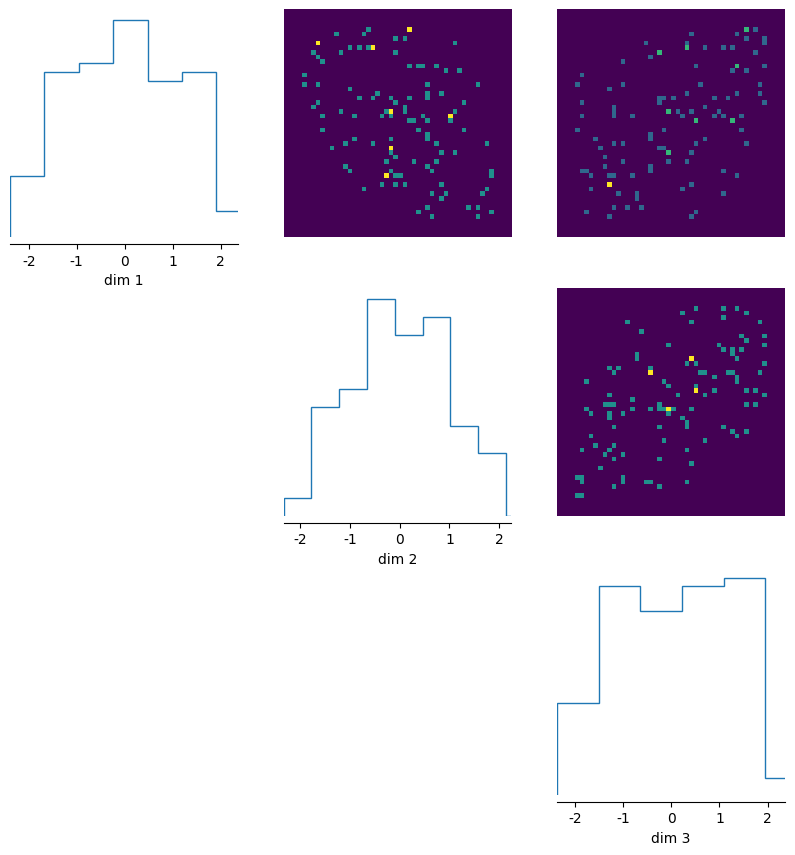
Lower diagonal#
We can add something in the lower off-diagonal as well.
from sbi.analysis.plotting_classes import KdeOffDiagOptions

_ = pairplot(
    [posterior_samples, posterior_samples],
    limits=[[-3, 3] * 3],
    figsize=(5, 5),
    diag=["hist", None],
    upper=["scatter", "contour"],
    lower=["kde", None],
    diag_kwargs=HistDiagOptions(
        mpl_kwargs={
            "bins": 10,
            "color": 'tab:blue',
            "edgecolor": 'white',
            "linewidth": 1,
            "alpha": 0.6,
            "histtype": "bar",
            "fill": True,
        }
    ),
    upper_kwargs=[
        ScatterOffDiagOptions(mpl_kwargs={"color": 'tab:blue', "s": 20, "alpha": 0.8}),
        ScatterOffDiagOptions(mpl_kwargs={"cmap": 'Blues_r', "alpha": 0.8, "colors": None}),
    ],
    lower_kwargs=KdeOffDiagOptions(mpl_kwargs={"cmap": "Blues_r"}),
    labels=[r"$\theta_1$", r"$\theta_2$", r"$\theta_3$"],
)
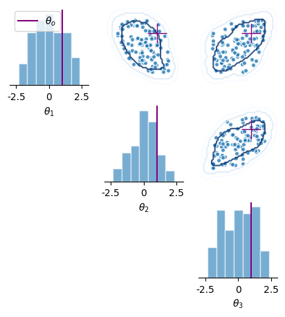
Adding observed data#
We can also add points, e.g., our observed data \(\theta_o\) to the plot.
# fake observed data:

theta_o = torch.ones(1, 3)

_ = pairplot(
    [posterior_samples, posterior_samples],
    limits=[[-3, 3] * 3],
    figsize=(5, 5),
    diag=["hist", None],
    upper=["scatter", "contour"],
    diag_kwargs=HistDiagOptions(
        mpl_kwargs={
            "bins": 10,
            "color": 'tab:blue',
            "edgecolor": 'white',
            "linewidth": 1,
            "alpha": 0.6,
            "histtype": "bar",
            "fill": True,
        }
    ),
    upper_kwargs=[
        ScatterOffDiagOptions(mpl_kwargs={"color": 'tab:blue', "s": 20, "alpha": 0.8}),
        ScatterOffDiagOptions(mpl_kwargs={"cmap": 'Blues_r', "alpha": 0.8, "colors": None}),
    ],
    labels=[r"$\theta_1$", r"$\theta_2$", r"$\theta_3$"],
    points=theta_o,
    fig_kwargs=FigOptions(
        points_labels=[r"$\theta_o$"],
        legend=True,
        points_colors=["purple"],
        points_offdiag=dict(marker="+", markersize=20),
        despine=dict(offset=0),
    ),
)
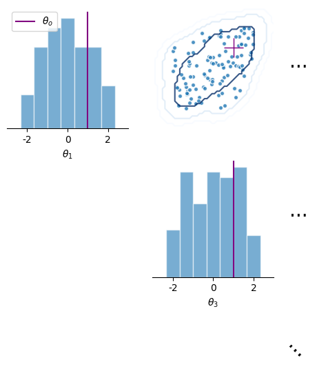
Subsetting the plot#
For high-dimensional posteriors, we might only want to visualise a subset of the marginals. This can be done by passing a list of entries to plot to the subset argument of the pairplot function.
_ = pairplot(
    [posterior_samples, posterior_samples],
    limits=[[-3, 3] * 3],
    figsize=(5, 5),
    subset=[0, 2],
    diag=["hist", None],
    upper=["scatter", "contour"],
    diag_kwargs=HistDiagOptions(
        mpl_kwargs={
            "bins": 10,
            "color": 'tab:blue',
            "edgecolor": 'white',
            "linewidth": 1,
            "alpha": 0.6,
            "histtype": "bar",
            "fill": True,
        }
    ),
    upper_kwargs=[
        ScatterOffDiagOptions(mpl_kwargs={"color": 'tab:blue', "s": 20, "alpha": 0.8}),
        ScatterOffDiagOptions(mpl_kwargs={"cmap": 'Blues_r', "alpha": 0.8, "colors": None}),
    ],
    labels=[r"$\theta_1$", r"$\theta_2$", r"$\theta_3$"],
    points=theta_o,
    fig_kwargs=FigOptions(
        points_labels=[r"$\theta_o$"],
        legend=True,
        points_colors=["purple"],
        points_offdiag=dict(marker="+", markersize=20),
        despine=dict(offset=0),
    ),
)
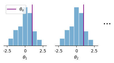
Plot just the marginals#
1D Marginals can also be visualised using the marginal_plot function
from sbi.analysis import marginal_plot

# plot posterior samples
_ = marginal_plot(
    [posterior_samples, posterior_samples],
    limits=[[-3, 3] * 3],
    subset=[0, 1],
    diag=["hist", None],
    diag_kwargs=HistDiagOptions(
        mpl_kwargs={
            "bins": 10,
            "color": 'tab:blue',
            "edgecolor": 'white',
            "linewidth": 1,
            "alpha": 0.6,
            "histtype": "bar",
            "fill": True,
        }
    ),
    labels=[r"$\theta_1$", r"$\theta_2$", r"$\theta_3$"],
    points=[torch.ones(1, 3)],
    figsize=(4, 2),
    fig_kwargs=FigOptions(
        points_labels=[r"$\theta_o$"],
        legend=True,
        points_colors=["purple"],
        points_offdiag=dict(marker="+", markersize=20),
        despine=dict(offset=0),
    ),
)